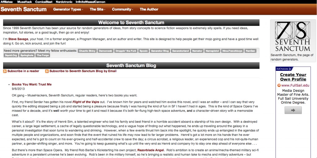
Since I finalized the design, I’ve now started moving it into code. Here’s a demo of the front page.
You’ll notice that I chose the 3rd logo because that one was overwhelmingly popular – and I have to say I dig it’s mixture of complexity, simplicity, and class. Thanks for the feedback. The first logo is also going to appear in a modified form for other things, perhaps buttons or something.
I have to alter the ad space (and color) and I’m having a devil of a time getting the blogfeed to format properly. On the other hand the new components are really smooth to redesign in Bootstrap, and very easy to alter.
I removed the social media buttons as extraneous for now but I might put them back. If there’s any suggestions on how to make it easier to sync up with the Sanctum, fee free to share.
Of course the real test is plugging in live generator code because, well, that’s the critical part of the site. The big issue is getting the nicely formatted forms to work and then getting the output properly and prettily formatted – which sounds easy, but there’s some variable data and presentation in here that may be a pain. I could jam it in unformatted, but it’d be pretty boring and not have the greatest layout.
I’m trying a very non-standard linkroll/siteroll/blogroll – smaller chicklets showing associated sites. I think it actually works.
Steven Savage is a Geek 2.0 writer, speaker, blogger, and job coach. He blogs on careers at http://www.musehack.com/, nerd and geek culture at http://www.nerdcaliber.com/, and does a site of creative tools at http://www.seventhsanctum.com/. He can be reached at http://www.stevensavage.com/.


