So I’m now on to the link pages – and I’m going to need some feedback.
So let’s get to the entries . . .
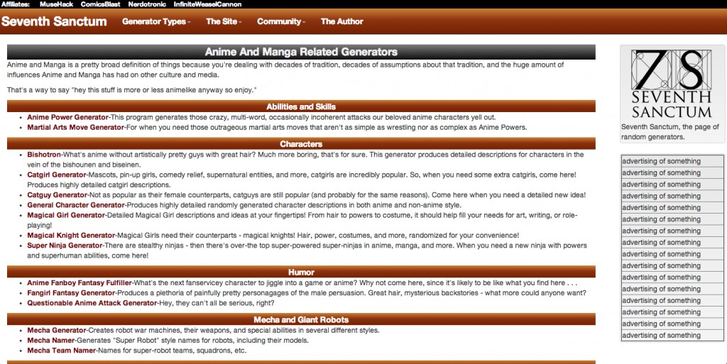
First up, it’s figuring out how to do the links. Yes bullet points and headers are nice but it’s kind of dull. Any thoughts on how to spice it up – or does this work well enough?

Next up, where do I put the other links.
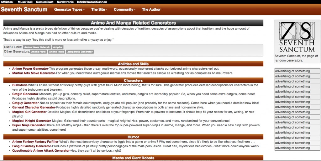
Now I could ditch them or have a big links page, but that seems kind of lame. I don’t want them in the right column. So I could also put them at the bottom:

Which looks OK but . . . is kinda bleh.
OR at the top which might be distracting.

I need your insights!
Steven Savage is a Geek 2.0 writer, speaker, blogger, and job coach. He blogs on careers at http://www.musehack.com/, nerd and geek culture at http://www.nerdcaliber.com/, and does a site of creative tools at http://www.seventhsanctum.com/. He can be reached at http://www.stevensavage.com/.


