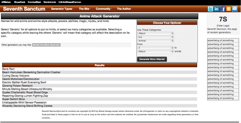
I’ve been redesigning Seventh Sanctum’s interface, looking for something more modern and more cross-device – and face it the look is a few years old. Fortunately friends have been quite helpful.
So here’s the latest design – and of course I need your feedback! The idea is to condense it and streamline it, use space better, and move the menus into responsive dropdowns. This keeps the space open for the results and lets me jack up the fonts – plus I can make it more cross-device.
Steven Savage is a Geek 2.0 writer, speaker, blogger, and job coach. He blogs on careers at http://www.musehack.com/, nerd and geek culture at http://www.nerdcaliber.com/, and does a site of creative tools at http://www.seventhsanctum.com/. He can be reached at http://www.stevensavage.com/.


